clean & minimal brand & website design
for tech startup
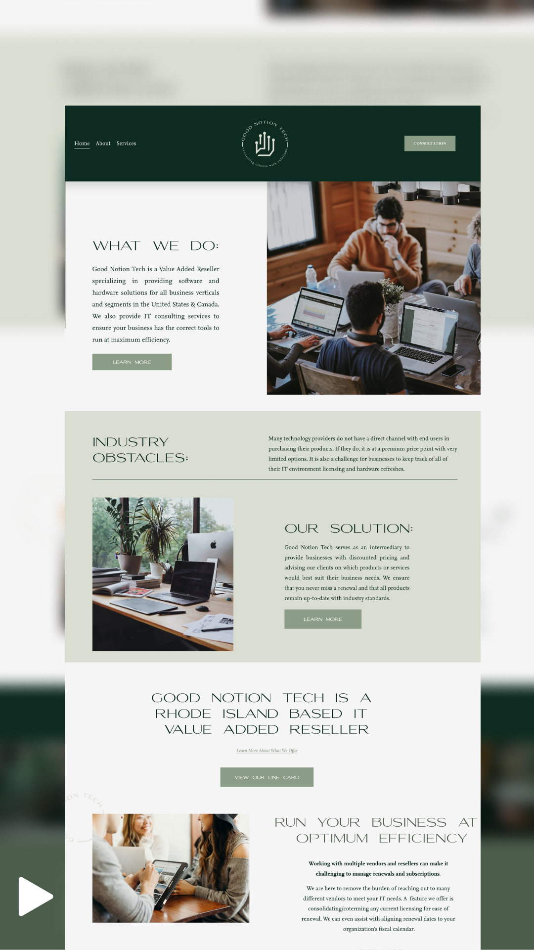
We recently had the pleasure of partnering with Good Notion Tech, a startup tech company known for its innovative solutions and commitment to excellence. Our collaboration with Good Notion Tech aimed to establish a strong and clarifying brand presence that would not only elevate their reputation but also resonate with their target audience. To begin the process, we conducted in-depth research into Good Notion Tech's core values, vision, and mission.
Project Details:
Design Concept
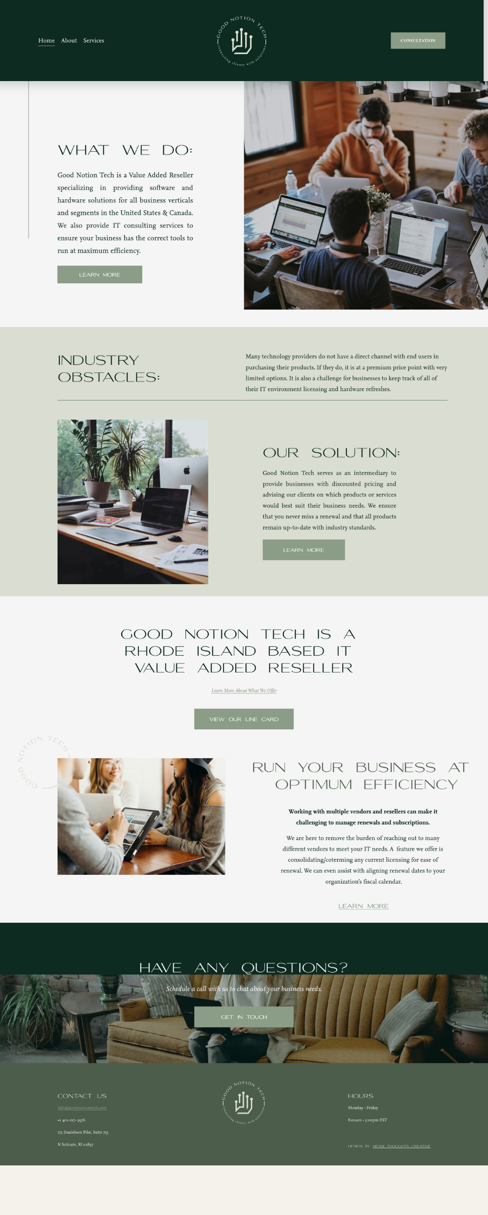
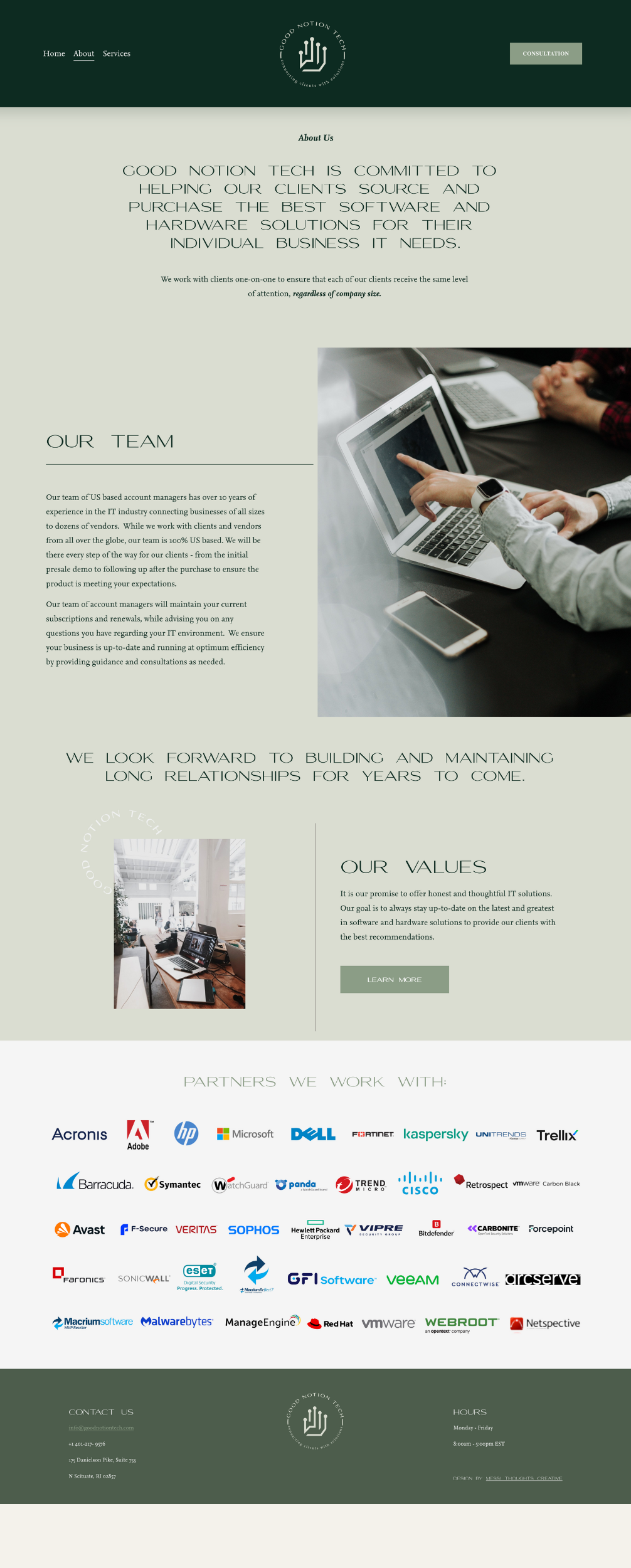
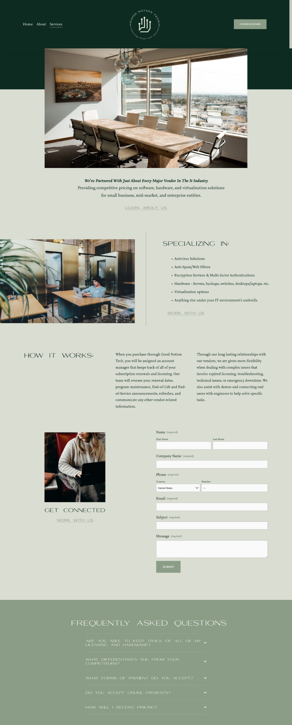
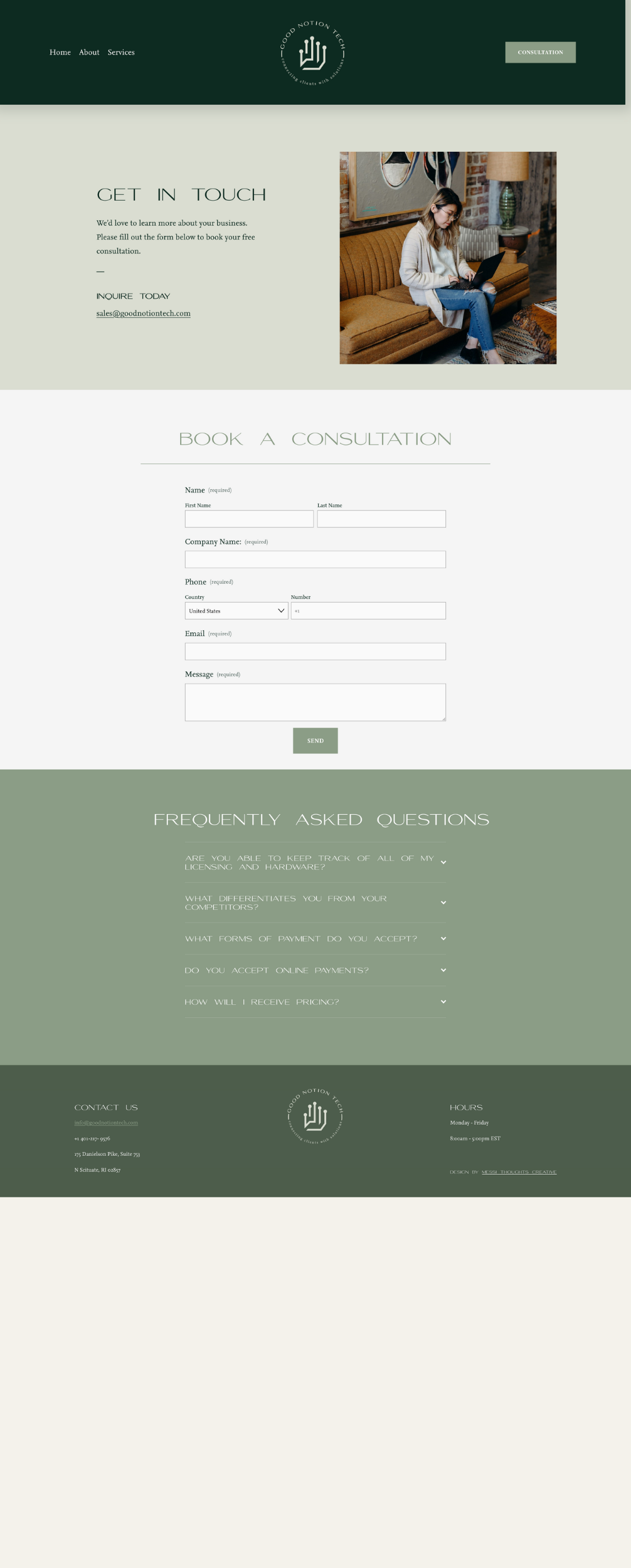
We embraced a clean and simple design philosophy, incorporating elements inspired by nature to emphasize simplicity and allow the content to shine without unnecessary visual clutter. The use of ample white space creates a sense of calmness and sophistication, maintaining a professional appearance. Minimalist typography paired with a refined color scheme achieves a perfect balance of functionality and aesthetics, creating a digital environment that is both visually pleasing and easy to navigate.
Color Palette
We curated a palette centered around emerald green, ensuring that every element seamlessly accentuates the inherent beauty of this captivating color. Complementary tones such as calming greens and earthy neutrals evoke tranquility and align with the sustainable practices that Good Notion Tech promotes. These colors create a luxurious and sophisticated feel through their interplay.


Typography
Our focus was on selecting clean and legible typefaces that exude simplicity. The chosen font pairing conveys a sense of modernity and approachability with a subtle tech feel, ensuring readability and a contemporary look.
Photography
High-quality imagery was carefully selected to elevate the luxurious feel of the website. We avoided visual clutter by choosing photos consistent with the color palette and brand’s target clientele, ensuring that visuals blended seamlessly with the design elements.
Website Layout and Navigation
We opted for a clutter-free, minimal page layout that allowed content to flow and breathe. Utilizing white space and soft accents, we created a sense of balance and focused on the most important elements. A simple navigation structure guides visitors effortlessly through the site, ensuring a seamless user experience.